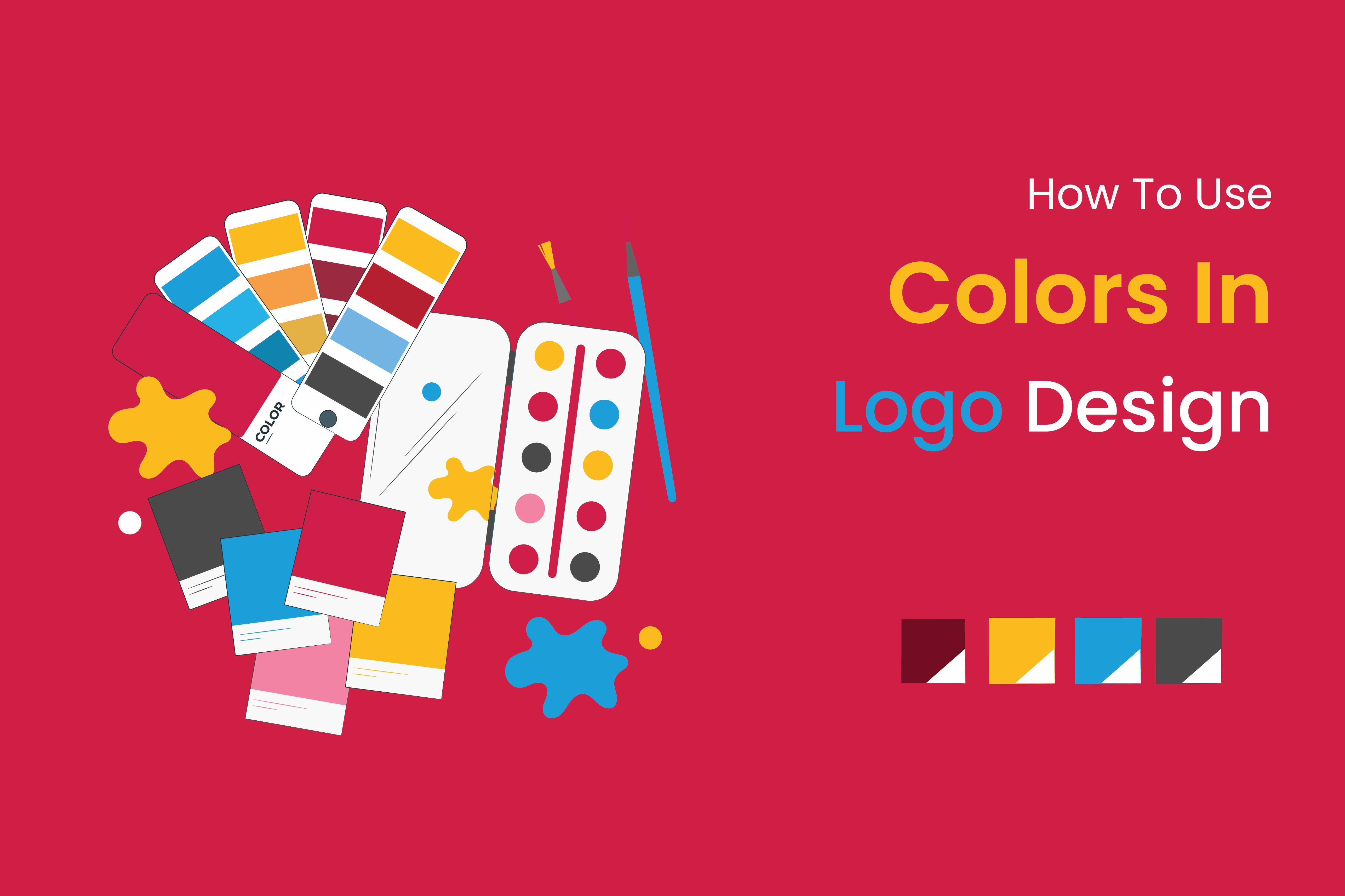
How To Use Colors In Logo Design
The best color for logo's color palette is a great opportunity to showcase your company's values and grab the attention of your ideal clientele. It's also possible for the opposite to happen if the improper ingredients are mixed together.
In accordance with the principles of "color psychology," it is common knowledge that various hues may evoke various responses from their viewers. As the sun is also a sunny yellow, the color yellow evokes feelings of happiness. Also, the color green provides a relaxing influence (like laying in the grass and looking up at a bunch of leaves is peaceful). Can we trust these so-called "laws" of logo coloration when it comes to marketing and product recognition?
The Ultimate Logo Color Guide
- ● Red, orange and yellow logos
- ● Green and blue logos
- ● Purple and pink logos
- ● Brown and black logos
- ● Gray and white logos
- ● How to choose a logo color
- ● How to combine logo color
- ● Standing out from the competition
Which logo colors mean what ?
1. Red logos
The color red is often associated with strong emotions like enthusiasm, passion, and fury. It's eye-catching and guarantees that people will notice you. How would you describe the tone of your brand? A red thought. Enhanced in depth, gravity, or seriousness. If you're not into red, you may want to avoid it.
Having a unique red logo created for your company by a skilled designer is a great way to let people know who you are and what your brand stands for. Ideas needed? These are some fantastic logos in red that were submitted by our international design community. Start dreaming up ideas for the ideal red logo right now.
2. Orange logos
When used appropriately, oranges can be both stimulating and fun. You'll get more attention if you wear orange. A less common choice than red, but just as energizing. If you want your company to come out as high-end or serious, you should probably steer clear of the color orange.
One of the more recent color words to be added to English was "orange." In old English, it was called "yellow-red." The word "orange" came from the French language when the orange fruit was brought from the Mediterranean.
Have a unique orange logo created for your business that reflects your brand's character. Ideas needed? These are some fantastic logos in orange that were submitted by our international design community. Use this orange logo as inspiration to begin crafting your ideal logo right now.
3. Yellow logos
Have a unique orange logo created for your business that reflects your brand's character. Ideas needed? These are some fantastic logos in orange that were submitted by our international design community. Use this orange logo as inspiration to begin crafting your ideal logo right now.
In subtractive color schemes, yellow is one of the primary colors since it was one of the first colors humanity learned to create. It's one of those versatile hues that may be associated with a wide range of things (gold, sunshine, fields of wheat and maize, etc.). Although a rich gold has more weight and history to it, a pale yellow is more airy and modern.
A professional designer can make you a yellow logo that shows off the personality of your brand. Are you stuck? We've gathered some of the best yellow logos from our community of designers around the world. Get ideas and start making plans for the perfect yellow logo today.
4. White logos
The lack of any color is represented by white. On its own, it has a tendency to give off an impression of being spotless and weightless, much like the fundamental nature of light itself. It is helpful for companies who want to give the impression that they are meticulous and systematic, and that their delivery is flawless. It also has the potential to be aspirational, standing in for a type of purity that is unreachable.
n spite of the fact that the majority of logos will also have a white version, this will almost always be combined with another hue (as a backdrop), with the latter taking centre stage. White is fresh and cost-effective whether used as an accent color or to lighten another hue. Yet, it's adaptable to a wide variety of labels.
5. Gray logos
A gray shade that is neither completely dark nor completely bright. Gray represents a neutral ground between the more extremes of young and old, modern and traditional, light and dark. Make it darker to enhance intrigue. Try to pare down in order to make things more accessible.
With a unique gray logo created especially for you by a skilled designer, you can showcase the uniqueness of your company. You're in need of suggestions. From our large international community of designers, we've gathered some fantastic examples of grey logos. Start designing the ideal gray logo design now by becoming inspired.
6. Black logos
It's all about being black these days. Do you want to seem polished, contemporary, and luxurious? It's time to pull the plug. Rather than, why not seem frugal and affordable? Keep your distance from the shadowy side.
Although orange and purple are colors, black is not. We can distinguish distinct hues because each corresponds to a unique wavelength of light. On the other side, black represents a total lack of illumination. While being as ancient as light, black has a contemporary air to it. Its stark minimalism lends all-black logos an air of mystery and exclusivity, which may be exploited by high-end companies.
7. Pink logos
Pink is one of the hues that may be used in a wide variety of contexts in today's contemporary, Western civilization. Pink may offer a company an appearance that is contemporary, young, and elegant. This applies to all shades of pink, from millennial pink to bright magenta.
When compared to other colors, pink stands out. In subtractive color schemes, each of the aforementioned six hues functions as a primary or secondary. Pink may be explained as a lighter shade of red. Yet, the English language lacks a homonym for the colors light blue and light yellow. In addition, the term "pink" first entered the English language in the 17th century, when it was associated with wealth. Thus, pink is still considered to be a fresh and modern hue many years after its introduction to the color palette.
8. Purple logos
The color purple represents the most opulent part of the rainbow. Employ purple to give the impression that you are both modern and experienced all at once.
It's likely that the color purple is associated with luxury due to the fact that historically, purple dye was highly costly, and as a result, the hue was only worn by very affluent people. Purple, on the other hand, is not considered to be an unduly solemn hue, despite the fact that it is linked to opulence and richness. This is an intriguing aspect of the color. Do you have a frivolous endeavor that costs a lot of money? The color purple is just right. Sell professional business attire? When you go up against a purple brand, you're going to be facing an uphill struggle.
9. Blue logos
The color blue is associated with dependability and wisdom. To be considered seriously as a business, you need to include it into your branding. You should know that more than half of all logos use blue since it is the traditional king of colors. You'll need to stand out from the crowd if you choose blue as your trademark color, since it's often associated with a sense of peace (think of the tranquility of a lake or river) and quiet.
If you want your business to be associated with timeless assurance and reliability, blue is the color to choose. If you work in the food industry, be aware of the color blue (it supposedly suppresses appetite). Choose a lighter shade of blue, closer to teal on the color wheel, if you're a fan of the color blue yet want to convey a sense of playfulness.
How to choose a logo color?
Think about the message you want your company to express the most before making a decision regarding the color scheme for your logo. Which of your many admirable qualities do you want to emphasize? Quickness, audacity in creativity, effectiveness, efficiency, compassion, and intuitiveness?
Logo colors should reflect your target customer's brand personality. People pick items that match their personalities. Colors help people classify items and services, find ones they like, and choose amongst comparable ones.
When you've decided what you want the brand identification of your company to stand for, go through the list of colors that are up there and figure out which ones could be able to assist you communicate what you want to say.
Color Schemes for Logos.
Although it's possible to get away with basing a single logo color entirely on brand personality attributes, mixing colors is where you'll need to think about visual harmony. Whilst your company's aesthetic may be natural and luxury, the colors brown and purple do not complement one another. But, there are methods available to assist you make use of established aesthetic rules when choosing and combining colors. .
How culture impacts logo color meanings?
It's important to understand the cultural connotations attached to the colors you choose for your logo if it will be seen by people of different backgrounds. White, for instance, is seen as a sign of purity in most Western civilizations but of death in other Eastern ones. Making smart color selections and understanding the significance of colors in logos requires some planning ahead of time and cultural awareness.
How To Use Colors In Logo Design Small 9 Tips:
Using colors effectively in logo design is crucial for creating a memorable and impactful logo. Here are 10 tips for using colors in logo design:
1. Choose colors that align with your brand's values and personality: Colors have different meanings and connotations, so it's important to choose colors that reflect your brand's values and personality.
2. Keep it simple: Avoid using too many colors in your logo, as this can make it appear cluttered and confusing. Use two to three colors.
3. Use complementary colors: Complementary colors are colors that are opposite each other on the color wheel, such as blue and orange or yellow and purple. Using complementary colors can create a sense of balance and harmony in your logo.
4. Consider color psychology: Colors can evoke different emotions and moods. For example, blue is often associated with trust and reliability, while red can evoke feelings of passion and excitement. Consider the emotions and moods you want your brand to convey when choosing colors.
5. Test your color choices: Before finalizing your logo design, test different color combinations to see what works best. You can use online tools such as Adobe Color or Color Hunt to help you choose complementary colors.
6. Use colors consistently: Once you've chosen your colors, use them consistently across all your branding materials, including your website, social media, and marketing materials.
7. Use negative space: Negative space is the space around and between the elements in your logo. Using negative space can create interesting and memorable designs, as seen in the FedEx logo.
8. Avoid trendy colors: While it can be tempting to use trendy colors in your logo, these colors can quickly become outdated. Stick to classic colors that will stand the test of time.
9. Consider printing and production: Keep in mind the printing and production process when choosing your colors. Some colors may look different on different materials or when printed in different formats. Test your logo in different formats before finalizing your design
Free Online Tools Logo Color Generator
1. Adobe Color: Adobe Color is a free online tool that lets you create and save color palettes. You can also explore popular color schemes and browse color themes created by other users.
2. Coolors: Coolors is a popular color palette generator that lets you create custom color schemes. You can adjust the colors using a variety of tools, including color sliders, randomize function, and more.
3. Color Hunt: Color Hunt is a curated collection of color palettes created by designers. You can browse the palettes by color or popularity and even download them for free.
4. Material Palette: Material Palette is a color palette generator that helps you create color schemes based on Google's Material Design guidelines. You can choose your primary and secondary colors, and the tool will generate a palette for you.
5. Canva Color Palette Generator: Canva's color palette generator lets you upload an image and create a color palette based on the colors in the image. You can also customize the colors and download the palette for free.
6. Paletton: Paletton is a color scheme designer that lets you create and customize color palettes. You can adjust the colors using a variety of tools, including hue, saturation, and brightness..
7. ColorSpace: ColorSpace is a free online color tool that lets you explore and generate color palettes. You can browse different color spaces and export your color palettes for free.
8. ColorHexa: ColorHexa is a color encyclopedia that provides information about different colors, including their RGB values, hex codes, and more. You can also generate color palettes based on the colors you choose
9. ColorMind: ColorMind is a color palette generator that uses AI to create unique color schemes. You can choose your primary color, and the tool will generate a palette based on that color.
10. Colordot: Colordot is a simple color picker tool that lets you choose colors by tapping on the screen. You can also adjust the brightness and saturation of the colors using gestures.
What color will your logo be?
It's not as easy as just deciding you like green and want a logo with a dark forest theme. Think about how you want your brand to come across to consumers, and use it to inform your color choices. It's wise to keep an eye on the competition as well. Have you considered the possibility that having a dynamic and enjoyable business in a more staid industry may help you succeed? There are times when going against the grain is preferable than going against the herd.
In the comments, tell us what shade your company's logo is (or will be). More Logo Design Advice Please read our post for some tips on creating a logo.
Final Words
Best logo Company is an important aspect of its overall brand's visual identity and representation. Technological advancements have made it possible for non-designers as well as designers to create logos with ease. These resources range from easy-to-use internet logo generators to complex graphic design programmes. There are advantages and merits to each. There are numerous tools out there, and picking the correct one might be difficult. But Clickbox's professional logo service can help you select the right solution for your goals and budget. Clickbox can assist anybody, from seasoned designers to newcomers, create a logo that stands out and successfully communicates the brand's message. Don't be hesitant to contact clickbox for the professional assistance you need if you have any concerns or queries regarding logo creation tools.

John Click
Digital Marketer | SEO Copywriter | Content Strategist
Experienced digital marketer with a proven track record in creating compelling content that not only engages audiences but also drives conversions and enhances SEO visibility. My expertise extends beyond marketing strategy to crafting persuasive narratives that resonate with your target audience. I combine data-driven strategies with captivating writing to deliver measurable results, ensuring your brand shines in the digital landscape.
Latest Posts

 Digital Marketing
Improve Your Website for SEO and Conversions

-
Digital Marketing
Social Media Marketing for Construction

-
Digital Marketing

 Digital Marketing
 Digital Marketing